The San Diego Padres are one of eight Major League Baseball teams to unveil new City Connect uniforms. MLB announced the new uniforms on Thursday, calling them reflective of “the energy and pride of each club’s community, offering bold and expressive interpretations that celebrate both team history and what’s ahead for the game.”
The City Connect brand of alternate uniforms launched in 2021. Teams can rotate in a new jersey after three years to debut a new look, and this marks the second installment of City Connects for each of the eight teams involved.
Padres Partner with Nike and Fanatics
Each club collaborated with Nike and Fanatics, MLB’s uniform manufacturer, to build off its previous City Connect styling. The aim is to delve into other aspects of their city, region and fan base.
The new uniforms will remain part of each club’s on-field rotation for multiple seasons.
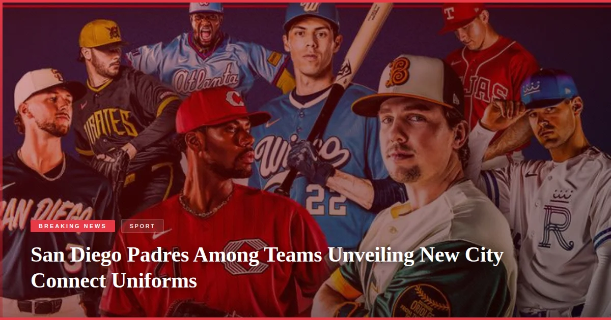
City Connect Uniform Design Themes
The new looks for the Braves, Orioles, Reds, Royals, Brewers, Pirates, Padres and Rangers were revealed. The uniforms are billed by MLB as reflective of “the energy and pride of each club’s community, offering bold and expressive interpretations that celebrate both team history and what’s ahead for the game.”
First launched in 2021, the City Connect brand of alternate uniforms have presented teams in novel colour schemes, typefaces and graphics that are designed to reflect cultural aspects of each team’s home city.
For each of the eight teams involved in Thursday’s announcement, this is the second installment of City Connects.
Other Teams’ City Connect Designs
The Atlanta Braves’ uniforms draw inspiration from the powder blue uniforms of the 1980s. The design features red piping, an updated “Atlanta” script and “ATL” block letter sleeve patch, pairing the team’s contemporary colour scheme with the throwback style.
The Baltimore Orioles’ uniforms pay tribute to the 1890s Baltimore Baseball Club with an old-school “B” on the cap. The uniform design also includes motifs that pay tribute to Camden Yards, including the brass home run plaques and the wrought-iron scoreboard clock, with the Oriole bird perched atop the “BMORE” lettering.
The Cincinnati Reds’ uniforms bring back pinstripes in a tone-on-tone style, nodding to the vest-style jersey the Reds last wore more than two decades ago. A sleeve graphic features the Tyler Davidson Fountain, which begins flowing each year around Opening Day.
The Kansas City Royals’ uniforms are inspired by the city’s official City of Fountains logo. A fuchsia-to-blue gradient highlights Kansas City’s iconic waterways, while a new twist on the “R” logo pays homage to the team’s original 1969 mark, and a heart logo reflects Kansas City’s placement in the country’s heartland.
The Milwaukee Brewers’ uniforms honour the Brew Crew’s role as Milwaukee’s team and Wisconsin’s team. A water-toned base and cream accent evoke the Badger State’s lakes, shores and bluffs, and a gradient wordmark is inspired by the state’s beautiful summer sunsets. The “Wisco” lettering on the chest, state motto on the collar and redesigned Barrelman sleeve patch all serve to celebrate the team’s history and Wisconsin’s rich heritage.
The new uniforms will remain part of each club’s on-field rotation for multiple seasons to come.